Keyboard accessibility is one of the foundations of an inclusive web. Users who navigate websites without a mouse rely on visible focus indicators to understand where they are on the page. WCAG 2.2 introduced Success Criterion 2.4.11 (Focus Appearance) to strengthen focus visibility requirements and make interactive components easier to use for people with visual impairments, low vision, motor disabilities, and keyboard-only navigation.
If you’re wondering what WCAG 2.2 Success Criterion 2.4.11 (Focus Appearance) is and how to pass it, the answer is straightforward: every keyboard-focusable element must display a focus indicator that is clearly visible, has sufficient contrast, and meets minimum size requirements. Designers and developers should avoid removing browser focus outlines unless they replace them with an equally or more visible custom indicator.
Quick Answer
WCAG 2.2 Success Criterion 2.4.11 (Focus Appearance) requires that keyboard focus indicators remain highly visible. The focus indicator must have adequate contrast against adjacent colors and occupy enough area around the focused element so users can easily identify their current keyboard position.
Definition Box
What Is Focus Appearance?
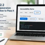
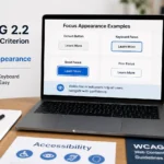
Focus Appearance is the visible styling that appears when a user navigates to an interactive element using a keyboard. Examples include outlines, borders, shadows, or highlight rings that indicate which button, link, input field, or control currently has keyboard focus
What Is WCAG 2.2 Success Criterion 2.4.11?
WCAG 2.2 Success Criterion 2.4.11 is a Level AA accessibility requirement published by the World Wide Web Consortium (W3C).
Its purpose is simple:
Keyboard users should always be able to clearly see which interface component currently has focus.
Many websites remove browser default outlines using CSS such as:
outline: none;
Without a proper replacement, keyboard users can become lost while navigating the page.
WCAG 2.4.11 addresses this issue by defining measurable requirements for focus indicators instead of relying on subjective design preferences.
Why Is Focus Appearance Important?
A visible keyboard focus indicator benefits many users, including:
People with low vision
Users with color blindness
Individuals with motor disabilities
Users with temporary injuries
Screen magnifier users
Keyboard-only users
Users with repetitive strain injuries (RSI)
Without a visible focus state, users may not know:
Which button is selected
Which form field is active
Which navigation item they’re using
Whether a modal dialog is focused
Where keyboard navigation has moved
Poor focus visibility directly impacts usability and accessibility.
What Does WCAG 2.4.11 Require?
To satisfy WCAG 2.2 Focus Appearance, the focus indicator should meet these requirements.
1. Visible Focus Indicator
Every keyboard-focusable component must display a visible focus style.
Examples include:
Outline
Border
Highlight ring
Box shadow
Background change (if compliant)
Invisible focus states fail the criterion.
2. Minimum Focus Indicator Area
The visible indicator must occupy sufficient area around the focused component.
The requirement is designed to ensure tiny or barely noticeable focus effects aren’t used.
3. Minimum Contrast
The focus indicator should have at least a 3:1 contrast ratio against adjacent colors.
A low-contrast outline that blends into the page background is insufficient.
4. Focus Must Remain Visible
Animations, overlays, sticky headers, or popups should never hide the focused element.
Users should always know where keyboard focus currently exists.
WCAG 2.4.11 Requirements at a Glance
Requirement
Pass
Fail
Visible outline
✔
✘ Hidden outline
3:1 contrast ratio
✔
✘ Low-contrast border
Adequate indicator area
✔
✘ Thin barely visible line
Keyboard navigation
✔
✘ Mouse-only interaction
Focus always visible
✔
✘ Hidden behind overlays
How to Pass WCAG 2.2 Success Criterion 2.4.11
Step 1: Keep Browser Focus Styles
Modern browsers already provide accessible focus outlines.
Avoid removing them unless you provide a better replacement.
Instead of:
button:focus{
outline:none;
}
Use:
button:focus-visible{
outline:3px solid #005fcc;
outline-offset:2px;
}
Step 2: Use High Contrast
The focus ring should clearly stand out.
Good examples include:
Blue outline on white
White outline on dark backgrounds
Yellow outline on dark blue
Black outline on light gray
Avoid subtle gray borders that disappear against similar backgrounds.
Step 3: Make Focus Indicators Large Enough
Tiny one-pixel borders can be difficult to detect.
Use:
2–4px outlines
Outline offsets
Box shadows
Double outlines where appropriate
The goal is immediate visibility.
Step 4: Test Every Interactive Element
Check focus indicators on:
Links
Buttons
Forms
Dropdown menus
Accordions
Navigation menus
Dialogs
Carousels
Tabs
Custom widgets
Interactive components should behave consistently throughout the site.
Step 5: Test with Keyboard Navigation
Disconnect your mouse.
Navigate using:
Tab
Shift + Tab
Enter
Space
Arrow keys
Escape
You should always know exactly where keyboard focus is located.
Common Focus Appearance Failures
Many accessibility audits reveal similar issues.
Examples include:
Removing outlines completely
Extremely thin borders
Low-contrast focus colors
Focus hidden beneath sticky headers
Focus disappearing after JavaScript updates
Custom components without keyboard focus
Modal dialogs losing focus
Dropdown menus trapping keyboard users
These issues commonly cause WCAG 2.4.11 failures.
CSS Example of a Compliant Focus Indicator
:focus-visible{
outline:3px solid #005FCC;
outline-offset:2px;
border-radius:4px;
}
This approach provides:
Strong visibility
Good contrast
Clear separation
Consistent appearance
Tools to Test Focus Appearance
Several accessibility tools can help identify focus issues.
Tool
Purpose
WAVE
Accessibility evaluation
axe DevTools
Automated WCAG testing
Accessibility Insights
Accessibility testing
Lighthouse
Accessibility audits
ARC Toolkit
Developer accessibility testing
Browser keyboard testing
Manual verification
Remember that automated tools cannot detect every focus visibility issue. Manual keyboard testing remains essential.
Best Practices for Developers
Follow these recommendations:
Never remove browser outlines without replacement.
Use :focus-visible instead of only :focus.
Maintain a minimum 3:1 contrast ratio.
Test keyboard navigation on every page.
Include focus testing in QA workflows.
Ensure custom components receive keyboard focus.
Document focus styles in your design system.
Best Practices for Designers
Designers should:
Include focus styles in UI mockups.
Define focus colors within the design system.
Verify contrast before development.
Design focus indicators for every interactive component.
Review keyboard navigation during usability testing.
Accessibility begins during design—not after development.
Common Mistakes to Avoid
Avoid these accessibility errors:
Using only color changes with insufficient contrast
It is a Level AA accessibility requirement that ensures keyboard users can clearly see which interactive element currently has focus. It defines minimum visibility, contrast, and size requirements for focus indicators.
Is Focus Appearance new in WCAG 2.2?
Yes. WCAG 2.2 introduced Success Criterion 2.4.11 to strengthen focus visibility requirements compared to earlier versions, helping create more consistent keyboard experiences.
Can I remove the default browser focus outline?
Yes, but only if you replace it with a custom focus indicator that meets or exceeds WCAG 2.2 requirements. Removing outlines without a compliant replacement causes accessibility failures.
What contrast ratio is required for focus indicators?
The visible focus indicator should have at least a 3:1 contrast ratio against adjacent colors, making it distinguishable for users with low vision or color perception differences.
Does :focus-visible help meet WCAG 2.4.11?
Yes. The :focus-visible pseudo-class allows developers to display focus styles primarily for keyboard interactions, improving usability while maintaining compliance when implemented correctly.
Can automated accessibility tools verify Focus Appearance?
Automated tools can identify many issues but cannot fully evaluate focus visibility or usability. Manual keyboard testing is necessary to confirm compliance with WCAG 2.2 Success Criterion 2.4.11.





Pingback: Logical Reading Order in a Scanned PDF: Step-by-Step Guide - AccessiComply