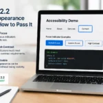
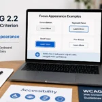
WCAG 2.2 Focus Appearance: How to Pass SC 2.4.11, requires keyboard focus indicators to be sufficiently visible when an interactive element receives focus. The requirement addresses more than simply having an outline: the focused indicator must provide enough visual area and contrast to make the focused component clear, while also remaining distinguishable from the unfocused state. To pass SC 2.4.11, developers need to implement a persistent, visible focus indicator that satisfies WCAG’s minimum area and contrast requirements and does not become hidden behind other content.
Direct Answer: How do you pass WCAG 2.2 SC 2.4.11?
To pass WCAG 2.2 Success Criterion 2.4.11 (Focus Appearance), provide a visible focus indicator around or otherwise identifying every keyboard-focusable component. The indicator must meet the required minimum size, contrast, and visibility conditions defined by WCAG 2.2, and it must not be completely obscured by author-created content.
What Is WCAG 2.2 Success Criterion 2.4.11?
WCAG 2.2 Success Criterion 2.4.11, Focus Appearance, is a Level AA accessibility requirement designed to make keyboard focus easier to see.
When users navigate a website using a keyboard, switch device, voice control software, or another input method that moves focus, they need to know which interactive element currently has focus.
For example, when pressing Tab, a user should immediately be able to identify whether focus is currently on:
A navigation link
A button
A search field
A form control
A checkbox
A radio button
A menu item
A dialog control
A custom interactive component
A browser’s default focus indicator may satisfy the requirement in some situations, but developers should not assume that every browser default automatically passes SC 2.4.11.
Definition Box: Focus Indicator
Focus indicator: A visual change that identifies the currently focused interactive component, such as an outline, border, background change, underline, or another clearly visible visual treatment.
Focus is different from hover. Hover indicates that a pointer is positioned over an element, while focus identifies the element currently targeted by keyboard or other sequential navigation.
Why Was Focus Appearance Added to WCAG 2.2?
WCAG 2.1 already included Success Criterion 2.4.7 Focus Visible, which requires keyboard focus to be visually apparent.
WCAG 2.2 introduced additional requirements through SC 2.4.11 Focus Appearance because simply making focus “visible” does not necessarily mean the indicator is sufficiently noticeable.
A thin, low-contrast border might technically make an element look different while still being difficult for a person with low vision to see.
SC 2.4.11 establishes more measurable requirements for the size and contrast of focus indicators.
What Does WCAG 2.2 SC 2.4.11 Require?
The requirement has several important parts.
A focus indicator must have sufficient:
Area
Contrast
Change from the unfocused state
Visibility
It also must not be completely hidden by content created by the website.
The exact WCAG wording and exceptions matter when evaluating complex components, so accessibility audits should be performed against the official WCAG 2.2 success criterion and its understanding and techniques documents.
What Is the Minimum Focus Indicator Size?
One of the most important aspects of SC 2.4.11 is the focus indicator’s area.
WCAG 2.2 defines a minimum focus indicator area that is equivalent to a 2 CSS pixel perimeter around the unfocused component.
For a rectangular component, this generally means the focus indicator needs sufficient visual area around the component rather than being merely a tiny decorative change.
This is why a simple 1px outline may not automatically satisfy the criterion.
Example of a potentially insufficient indicator
button:focus {
outline: 1px solid #999;
}
The problem is not simply that the outline is 1 pixel. The complete evaluation depends on the indicator’s visual area and contrast against the relevant backgrounds.
A stronger implementation is:
button:focus-visible {
outline: 3px solid #005fcc;
outline-offset: 2px;
}
The exact colors should still be tested against the page background and the component’s surrounding colors.
What Contrast Does a Focus Indicator Need?
SC 2.4.11 requires the focus indicator to have sufficient contrast.
The WCAG 2.2 requirement generally evaluates the contrast between the focus indicator and the adjacent colors.
A focus indicator should have at least 3:1 contrast against the colors immediately adjacent to the indicator, subject to the criterion’s specific conditions and exceptions.
This is particularly important for:
Gray borders on white backgrounds
Light outlines on light buttons
Dark outlines on dark sections
Focus rings placed over photographs
Components with changing backgrounds
Dark-mode interfaces
Example
Suppose a website uses a pale-gray focus ring around a white input field. The focus ring may technically exist, but if users with low vision cannot distinguish it from the surrounding white background, the implementation can fail the contrast requirement.
Does the Focus Indicator Have to Be a Border?
No.
WCAG 2.2 does not require a specific visual design such as an outline or border.
A focus indicator can use:
Outline
Border
Background change
Underline
Box shadow
Multiple visual treatments
A combination of visual changes
The important question is whether the resulting indicator satisfies the success criterion.
For most websites, however, a strong outline or box-shadow is easier to implement consistently than changing the entire component’s background.
How to Pass WCAG 2.2 SC 2.4.11
Use the following implementation process when auditing a website.
Step 1: Identify Every Focusable Component
Start by identifying all elements that users can focus.
Common examples include:
<a href=”/services”>Services</a>
<button type=”button”>Open Menu</button>
<input type=”text” name=”email”>
<select name=”country”>
<option>United States</option>
</select>
Also check custom JavaScript components.
Do not limit your audit to native HTML elements.
Step 2: Navigate the Website Using the Keyboard
Press Tab repeatedly through the page.
Check whether the focus location is immediately obvious.
Test:
Header navigation
Main content
Forms
Search
Buttons
Dropdowns
Modals
Accordions
Tabs
Carousels
Footers
Custom controls
If you cannot quickly identify where keyboard focus is located, investigate the component.
Step 3: Check the Focus Indicator’s Size
Inspect the focus ring visually and, where necessary, with developer tools.
A common robust pattern is:
:focus-visible {
outline: 3px solid #005fcc;
outline-offset: 2px;
}
The values are examples, not a universal guarantee of compliance. The final implementation must be evaluated against the component and surrounding colors.
Step 4: Check Contrast
Measure the focus indicator against its adjacent background.
A practical target is a focus treatment with strong visual contrast rather than a subtle gray line.
For example:
:focus-visible {
outline: 3px solid #005fcc;
}
Do not select the color solely because it looks attractive in the design system. Test it.
Step 5: Make Sure the Indicator Is Not Clipped
This is an often-overlooked problem.
For example:
.card {
overflow: hidden;
}
If a focus outline extends beyond the card and gets clipped, the user may not see the complete indicator.
Check:
overflow: hidden
Clipping containers
Sticky headers
Fixed navigation
Modals
Scrolling regions
Overlapping elements
Focus Appearance: Good vs. Risky Implementations
Implementation
Accessibility Risk
Recommended Action
Browser default focus indicator
Depends on browser/context
Test it
outline: none with no replacement
Very high
Fix immediately
Very thin, low-contrast border
High
Strengthen indicator
3px contrasting outline
Generally robust starting point
Test against WCAG criteria
Focus ring hidden by overflow
High
Remove clipping or redesign
Focus visible only on mouse hover
High
Provide keyboard focus
Strong :focus-visible styling
Good starting pattern
Validate with testing
Why outline: none Can Cause Accessibility Problems
A common accessibility mistake is removing focus styling to make a website look cleaner.
For example:
button:focus {
outline: none;
}
This can eliminate the user’s primary visual indication of keyboard focus.
If the outline is removed, you need to provide an equivalent or stronger focus treatment.
For example:
The goal is not to preserve the browser’s default appearance. The goal is to provide a clear and compliant focus indication.
Should You Use :focus or :focus-visible?
For modern websites, :focus-visible is often the preferred styling mechanism for showing a prominent focus indicator when the browser determines that focus should be visually indicated.
Focus indicators can become difficult to see when an interactive element overlays an image.
For example, a transparent button placed over a photograph may have a focus ring that blends into parts of the image.
A solution may involve:
A contrasting outline
An offset focus ring
A second contrasting border
A background treatment
A consistent component container
The implementation should be tested at the actual locations where the component appears.
How to Test WCAG 2.2 Focus Appearance
Automated accessibility tools can help identify focus-related issues, but SC 2.4.11 requires visual and interaction testing.
A practical audit should combine automated tools with manual keyboard testing.
Manual test
Open the webpage.
Avoid using the mouse.
Press Tab.
Observe the focused element.
Continue through every interactive component.
Check whether the indicator is clearly visible.
Test menus, dialogs, forms, and custom widgets.
Test different backgrounds and responsive layouts.
Test both light and dark themes if available.
Automated Testing vs. Manual Testing
Testing Method
What It Can Help Identify
Limitation
Automated scanner
Some focus-related code problems
Cannot reliably judge every visual requirement
Browser DevTools
CSS, dimensions, colors
Requires human interpretation
Keyboard testing
Actual focus visibility
Manual and time-consuming
Contrast analyzer
Color contrast
Does not evaluate the complete user experience
Screen reader testing
Interaction and focus behavior
Does not replace visual focus testing
A serious WCAG 2.2 audit should not rely on a single automated scanner.
Common WCAG 2.2 SC 2.4.11 Failures
1. Removing the Default Outline
*:focus {
outline: none;
}
This is one of the most obvious problems when no replacement indicator is provided.
2. Using a Low-Contrast Focus Ring
A pale gray outline on a white background may be technically visible to some users but insufficiently distinguishable.
Use a tested, high-contrast focus treatment.
3. Making the Focus Ring Too Small
A tiny visual change may not provide enough focus-indicator area.
A more substantial outline or equivalent treatment is usually easier for users to identify.
4. Clipping the Focus Ring
A component can have correct CSS while still failing in practice if another element clips or covers the focus indicator.
Always test the rendered result.
5. Styling Only :hover
This does not provide keyboard focus.
For example:
button:hover {
border: 2px solid blue;
}
This affects pointer interaction, not necessarily keyboard focus.
Instead:
button:hover,
button:focus-visible {
border: 2px solid blue;
}
The final design should still be evaluated against all applicable WCAG requirements.
A Practical CSS Pattern for Focus Appearance
A simple starting point for many design systems is:
:focus-visible {
outline: 3px solid #005fcc;
outline-offset: 3px;
}
For components that require a more controlled visual treatment:
.button:focus-visible {
outline: 3px solid #005fcc;
outline-offset: 3px;
border-radius: 4px;
}
The CSS itself does not prove WCAG compliance. You must evaluate the rendered focus indicator against its background, size, position, and surrounding content.
WCAG 2.2 Focus Appearance Checklist
Before declaring SC 2.4.11 complete, verify:
Every interactive component can receive focus where appropriate.
Keyboard users can identify the focused component.
Focus styling has sufficient visual area.
Focus styling has sufficient contrast.
Focus indicators are not clipped.
Focus indicators are not hidden behind other content.
outline: none is not removing focus without a replacement.
Forms have visible focus states.
Navigation links have visible focus states.
Buttons have visible focus states.
Custom JavaScript widgets have visible focus states.
Dialog controls have visible focus states.
Focus works across responsive layouts.
Light and dark themes have been tested.
Keyboard testing has been performed manually.
What Is the Difference Between WCAG 2.4.7 and 2.4.11?
These two criteria are closely related but should not be treated as identical.
This distinction matters because passing Focus Visible does not automatically mean that an implementation satisfies Focus Appearance.
How AccessiComply Can Help With WCAG 2.2 Focus Compliance
For organizations working toward WCAG 2.2 compliance, focus appearance should be evaluated as part of a broader accessibility audit rather than treated as an isolated CSS issue.
A complete audit should also examine other relevant WCAG requirements, including focus order, keyboard operation, target size, contrast, and focus obstruction.
Frequently Asked Questions
What is WCAG 2.2 Success Criterion 2.4.11?
WCAG 2.2 Success Criterion 2.4.11, Focus Appearance, requires a sufficiently visible focus indicator for user interface components. It adds measurable requirements concerning the indicator’s area, contrast, and visibility.
What is the minimum focus indicator size under WCAG 2.2?
SC 2.4.11 specifies a minimum focus-indicator area equivalent to a 2 CSS pixel perimeter around the unfocused component, subject to the criterion’s detailed conditions and exceptions. Developers should evaluate the actual rendered indicator rather than relying solely on a particular CSS pixel value.
Does a 1px focus outline pass WCAG 2.2?
A 1px outline should not automatically be considered compliant. WCAG 2.2 evaluates the focus indicator’s overall area and contrast, so the implementation needs to be assessed against the complete SC 2.4.11 requirements.
Does outline: none fail WCAG?
Removing an outline is not automatically a failure if an equivalent compliant focus indicator is provided. However, using outline: none without another clearly visible focus treatment creates a serious accessibility problem.
Does WCAG require a specific focus-ring color?
No. WCAG does not prescribe one universal focus-ring color. The selected indicator must provide sufficient contrast and visibility in the context where it appears.
Can automated accessibility tools test SC 2.4.11?
Automated tools can identify some potential focus problems, but they cannot replace manual visual and keyboard testing for all aspects of SC 2.4.11. A reliable audit should combine automated checks, browser inspection, contrast analysis, and keyboard navigation.





Pingback: WCAG 2.2 Focus Appearance (2.4.11): How to Pass It - AccessiComply